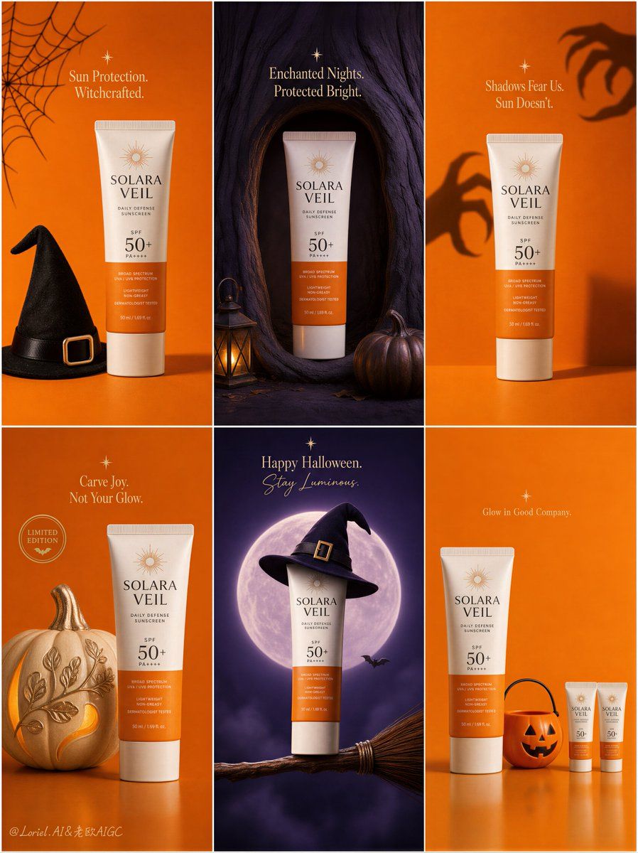
Create a Cannes-level ultra-premium seasonal campaign board for an original sunscreen brand called "SOLARA VEIL", designed as one single vertical poster composed of six equal rectangular panels arranged in a clean 2-by-3 grid. The campaign must preserve a strict modular social-ad structure while evolving into a more elevated, curated, and luxury seasonal release system. Every panel must feel like part of one unified international brand campaign kit, with identical margin discipline, consistent product orientation, unified typography logic, coherent lighting language, and tightly controlled orange-violet palette rhythm. The overall result must feel like a premium Halloween limited-edition packaging launch board rather than a busy holiday flyer.
Global campaign structure:
Use a perfectly disciplined six-panel grid with narrow clean gutters and strong architectural spacing. Maintain strict consistency across all six tiles: same sunscreen tube design, same logo system, same product angle, same package realism, same shadow behavior, same typographic hierarchy, same restrained premium Halloween identity, and the same visual cadence from panel to panel. Alternate vivid pumpkin orange and deep twilight violet fields in a highly art-directed rhythm, with occasional warm cream highlights and soft black accents. The sunscreen tube must always remain the hero in every tile. Each panel should contain only one core seasonal prop or concept, with significantly increased negative space and reduced visual clutter, so the whole board feels more gallery-like, elevated, and globally deployable.
Product design:
Design the sunscreen as a premium modern skincare tube with an elegant warm-white body, a sun-orange lower panel, a refined minimalist logotype for "SOLARA VEIL", a clear and beautifully integrated "SPF 50+" mark, subtle premium print texture, realistic cap geometry, tactile soft-matte plastic finish, and clean commercial reflections. The tube must feel globally premium, dermatology-trusted, luxurious, and highly believable. Keep the product front-readable, proportionally accurate, and sharply rendered in every panel. Across the six tiles, preserve a highly consistent product pose and visual scale so the campaign reads like one unified brand system rather than six unrelated posters.
Orbit enhancement:
Push the campaign toward a flagship brand-identity system. Strengthen the consistency of logo placement, text weight, margin spacing, product angle, and orange-violet chromatic relationship across all six panels so the board feels almost like a visual constitution for the seasonal campaign. Each panel must feel more iconic and distilled, with the sunscreen tube reading as the undisputed center of gravity. The entire board should feel more premium, more coherent, and more memorable, suitable for global rollout across social media, e-commerce, in-store screens, and launch decks.
Port transformation:
Keep the six-panel skeleton and product-led logic unchanged, but reconstruct the visual world into a more minimal limited-edition packaging release board. Reduce decorative Halloween elements dramatically. Each tile must feature only one central seasonal cue or one highly selective supporting object, paired with the sunscreen tube and generous negative space. Eliminate cute clutter and transform the campaign into a cleaner, more curated, more design-forward expression of seasonal branding. The result should feel like a luxury FMCG seasonal visual system with art-book clarity and collectible packaging energy.
Panel 1, top-left:
Create a vivid pumpkin-orange flat-lay tile with the sunscreen tube centered or slightly off-center as the hero product. Add only one core seasonal prop, such as a minimal black witch hat or a single refined spiderweb motif. Include one concise premium English promotional line, newly invented and not copied from any source, placed with disciplined spacing and sculptural clarity. The panel should feel bright, graphic, and controlled.
Panel 2, top-center:
Create a deep twilight-violet tile with the sunscreen tube placed inside a clean magical niche carved into a stylized tree trunk or shadowed vertical form. Use only one or two supporting details, such as one lantern glow and one pumpkin at the base. The atmosphere must feel enchanted but restrained. Add a short premium English seasonal line near the top area with elegant spacing. This tile should feel cinematic, mysterious, and premium rather than crowded.
Panel 3, top-right:
Create a minimal pumpkin-orange studio tile with the sunscreen tube standing upright in the lower center, while one pair of soft shadow-hands or abstract monster silhouettes reaches subtly across the background wall. Keep everything else stripped back. Use one short English line above or beside the product, integrated into the negative space. The concept should communicate protection through restraint and bold simplicity.
Panel 4, bottom-left:
Create a soft orange seasonal still life featuring the sunscreen tube beside one single sculptural pumpkin element, decorated in a premium minimal way, such as a clean frosting surface or elegant carved pattern. Add one small circular promotional seal or badge and one concise premium English phrase. The tile should feel festive but editorial, styled more like a luxury holiday release visual than a playful cluttered ad.
Panel 5, bottom-center:
Create a deep violet fantasy tile with the sunscreen tube hovering above or resting on one refined broom, topped with a single minimal witch-hat accent. Add a softly glowing moon or spotlight disk behind the product. Keep bats and spark elements extremely restrained, at most one or two tiny details. Include one compact elegant English Halloween greeting or campaign line. This tile should feel iconic, graphic, and collectible.
Panel 6, bottom-right:
Create a minimal orange geometric tile featuring one full-size sunscreen tube and one highly selective accessory such as a single pumpkin bucket, one candy-striped element, or one small lineup of miniature tubes arranged with precise spacing. The layout should feel rhythmically designed and almost packaging-editorial in tone. Use only micro-copy if absolutely needed. This tile should close the board with strong order, wit, and premium restraint.
Typography and graphic system:
All text across the six tiles must be newly invented, premium, and elegantly restrained. Use English only. The typography system must feel highly unified across all panels: same family logic, same spacing discipline, same hierarchy, same refinement. Blend premium serif display with subtle handwritten or rounded accents only when necessary, but keep the system controlled and minimal. Typography must function as part of the composition, never overwhelming the product, never covering recognition zones, never becoming noisy. The overall text density must be lower than a typical seasonal campaign, with much more breathing room and sharper hierarchy.
Lighting and atmosphere:
Use premium commercial lighting tailored to each tile while preserving strong overall consistency. Orange tiles should feel studio-clean, warm, and softly radiant. Violet tiles should feel cinematic and moonlit, with refined rim light and gentle ambient glow. In every panel, the sunscreen tube must show impeccable readability, soft glossy highlights, accurate cylindrical form, premium skincare realism, and clean separation from the background. Avoid muddy darkness, flat light, and excessive contrast.
Material and prop realism:
Every seasonal prop must feel tactile, selective, and impeccably styled: matte pumpkin skin, velvet-dark hat fabric, delicate web texture, brushed broom fibers, softly glowing lantern glass, smooth studio surfaces, and crisp premium packaging plastic. The contrast between minimal festive cues and sophisticated skincare packaging must feel intentional and elegant. Keep the props reduced, clean, and visually quiet.
Design intent:
The final artwork must feel like a world-class premium sunscreen Halloween campaign board transformed into a curated seasonal brand system. It should balance festive recognizability with luxury restraint, combining six-tile modular clarity, product dominance, refined typography, minimal prop language, and a collectible limited-edition atmosphere. The sunscreen tube must remain the visual leader in every panel. The campaign must feel clever, upscale, highly shareable, and suitable for international brand launch materials.
Rendering style:
ultra-realistic premium skincare campaign board, six-panel Halloween luxury release system, minimalist seasonal packaging editorial, refined sunscreen packaging realism, orange and violet modular brand world, cinematic product lighting, curated FMCG advertising design, reduced-prop premium social campaign, collectible holiday visual system, 8k, world-class image quality
Negative prompt:
copied original text, Arabic text, copied source slogan, cheap Halloween flyer, generic pharmacy ad, ugly font, heavy black font, cluttered layout, weak product focus, deformed sunscreen tube, broken cap, unreadable label, malformed letters, low-detail props, messy pumpkins, chaotic decoration, too many bats, too many candy elements, visual noise, muddy purple shadows, flat orange lighting, inconsistent brand system, low resolution, compression artifacts, amateur poster design, human faces, hands, extra people